Responsive Web Design (RWD)
13 March 2013

You may have heard recently a lot of talk about 'Apps' and how everyone needs an 'app' for their website to make it accessible to mobile users on iPhone, iPad, Android and other devices.
The reality is that you don't need an app for your website to be accessible. Using current technologies you can have a website that changes layout based on the size of the browser viewport. This is known as responsive web design (RWD).
Aside from the obvious savings in time and money, having a single website for all devices means no duplication of content and no extra time or complications in making updates.
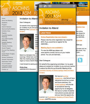
To the right you can see an example of a recent website we've built using this technique and how it appears in desktop and mobile views. You can see a similar effect on this, the Chirp website either when using a mobile browser or if you resize your browser window to be narrower.
To fit into the narrower viewport the main menu is removed and replaced with an icon or drop-down. The banner is replaced with a mobile version, and the news column becomes part of the main content. You may also notice changes to the font size to improve legibility.
We can apply this to both old and new websites, though for existing websites it will usually require new graphics and rethinking the layout of some pages.
If you're interested in having this for your website, please get in touch.