examples of responsive (rwd) websites
Below you can see examples of responsive websites adjusting their layout automatically to different browser sizes - from the larger desktop size (1,024 pixels and higher) down to tablets (600 - 800 pixels) and mobiles (400 - 600 pixels).
Note that the text content remains the same size, while the menu an other graphical elements adjust to a more compact and mobile friendly configuration.
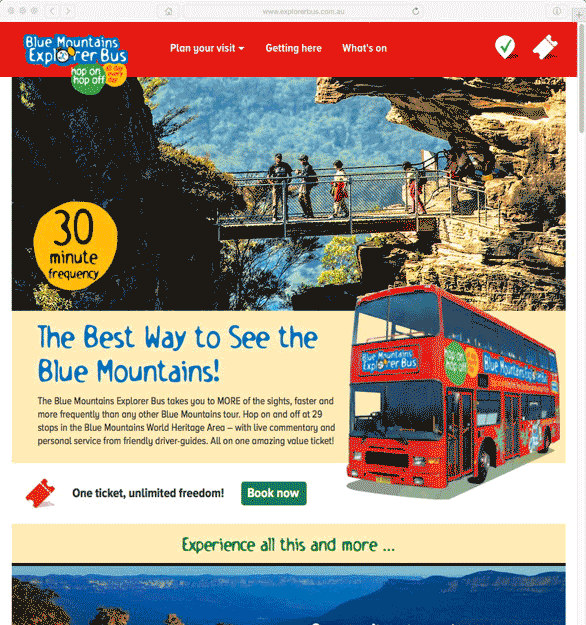
Blue Mountains Explorer Bus - Fluid Design
Here you can see a fluid transition from Desktop to Tablet and Mobile sizes. At the viewport narrows certain elements are compressed or hidden.
There is no single transition, but rather a series of steps at different widths creating a view suitable for the current viewport size.
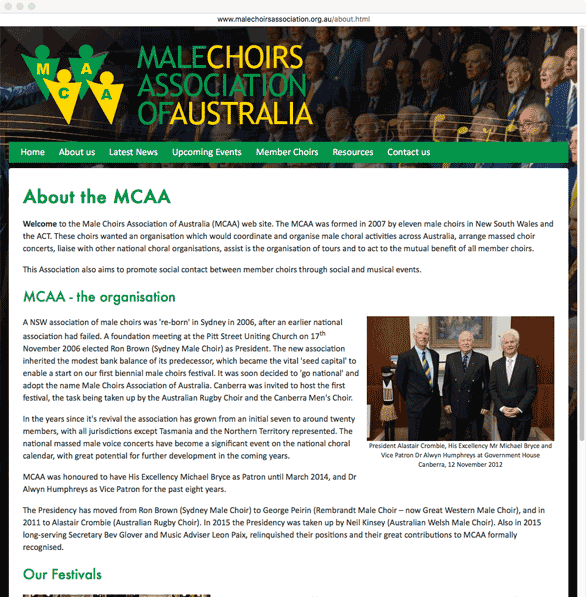
Male Choirs Association - Basic Responsive Design
In this example you can see a single transition between the Desktop (fixed-width) layout and a more flexible mobile layout with a compressed navigation menu.
Within the website content, photos are made larger for mobile, and tables are unrolled vertically to fit into the browser window.
You can see this for yourself by opening a website in a desktop browser window and then gradually dragging its corner/edge inwards to make the window narrower.